

Mine have always been a bit functional, and I’m curious what more creative people have achieved.
Anyone fancy showing off what they’ve put together? Feel free to blank out personal information, obviously.
And on another note, I’m now moderating this sub. Hi!
Let me know if there is anything you’d like to see added to the sidebar, I’m aiming to update it over the next few days.
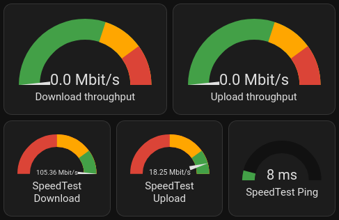
My “What’s the internet connection up to?” card:
My “Leaving the house” card:

It’s nice to compare the local predicted temperature, and local sensor.
deleted by creator
Good news: The gauge card is a standard component.
It is indeed! Mostly just fiddling around with the settings.
@smeg@feddit.uk, here is a paste of the config so you can play with it:
(If you click show code editor, then paste in, you can then go back to visual editor with things configured)
Speedtest needle gauges and ping with colour change:
type: horizontal-stack
cards:
  - type: gauge
    min: 0
    severity:
      green: 80
      yellow: 50
      red: 0
    entity: sensor.speedtest_download
    max: 100
    needle: true
  - type: gauge
    min: 0
    max: 20
    entity: sensor.speedtest_upload
    severity:
      green: 16
      yellow: 10
      red: 0
    needle: true
  - type: gauge
    min: 0
    entity: sensor.speedtest_ping
    severity:
      green: 0
      yellow: 15
      red: 20
    max: 100
Air quality with lots of different colours:
type: horizontal-stack
cards:
  - type: gauge
    entity: sensor.oxford_air_quality_index
    needle: false
    min: 0
    max: 500
    segments:
      - from: 0
        color: '#00e400'
      - from: 51
        color: '#ffff00'
      - from: 101
        color: '#ff7e00'
      - from: 151
        color: '#ff0000'
      - from: 201
        color: '#8f3f97'
      - from: 301
        color: '#800000'
    name: 'Air quality: PM2.5'
    unit: µg/m3
  - type: gauge
    entity: sensor.external_environment_f
    max: 40
    severity:
      green: 18
      yellow: 25
      red: 30
    needle: false
    min: -10
  - type: gauge
    entity: sensor.oxford_uv_index
    max: 10
    severity:
      green: 0
      yellow: 3
      red: 6
Once you’ve got your head around horizontal stacks (lets you put multiple small dials together), it’s mostly picking thresholds and settings colours.